The Knicks have decided to rip off the Mets and take the black out of their uniforms starting this season. The new look also features a crew neck (instead of a v-neck) and a colorful waistband on both the home and road jerseys.
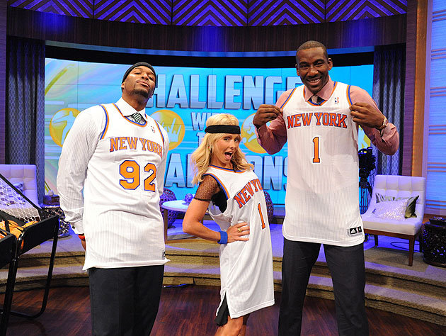
I’m not a fan of the adjustment to the “New York” font, but overall the uni looks pretty fly. Here it is being modeled by forward Amar’e Stoudemire as well as Kelly Rippa and her new co-host Michael Strahan (courtesy of KnickSwag.com):
It’s kind of strange how the shoulder/neck stripes stop abruptly at chest level, but it’s not a huge problem.
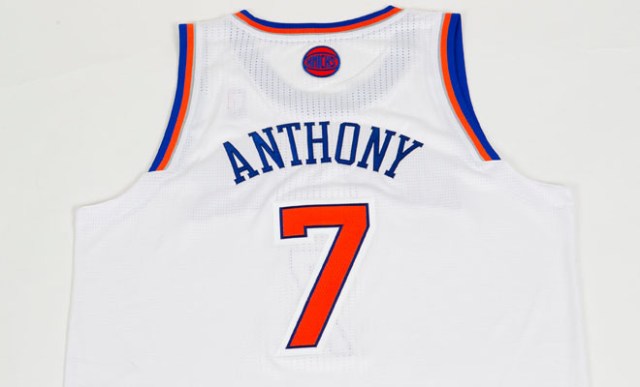
Here’s the back of the jersey (from KnicksNow.com). As you can see, they’ve taken out the ugly “NYK” round logo thing and replaced it with a much nicer “Knicks” round logo thing. Not bad, but if you’re going to go with an overly simplistic design, why include the above-the-name logo at all? Did the NBA make it a requirement?
The Knicks made a fine decision in taking the black out of their unis, but I’ll need to see these babies in action before I make a final judgement. At the very least, they’re a nice contrast to what promises to be a very black Brooklyn uniform set.


